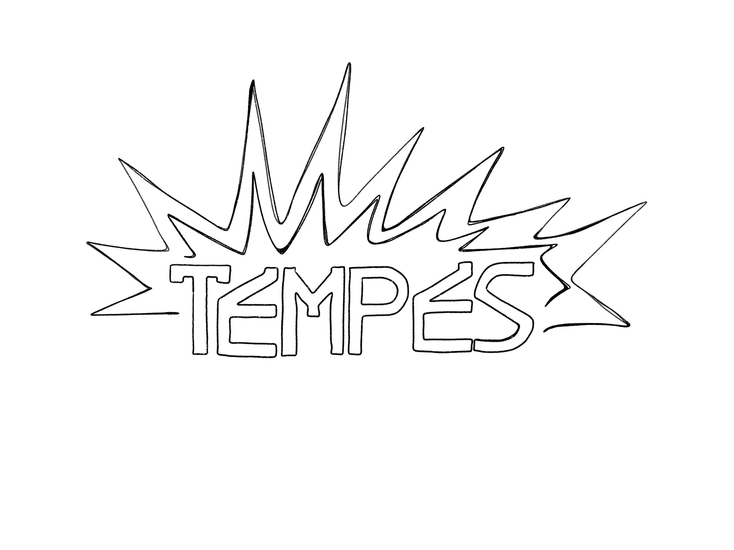
TEMPES
Art Instructor: Scott Laserow
Institution: Tyler School of Art and Architecture, Temple University
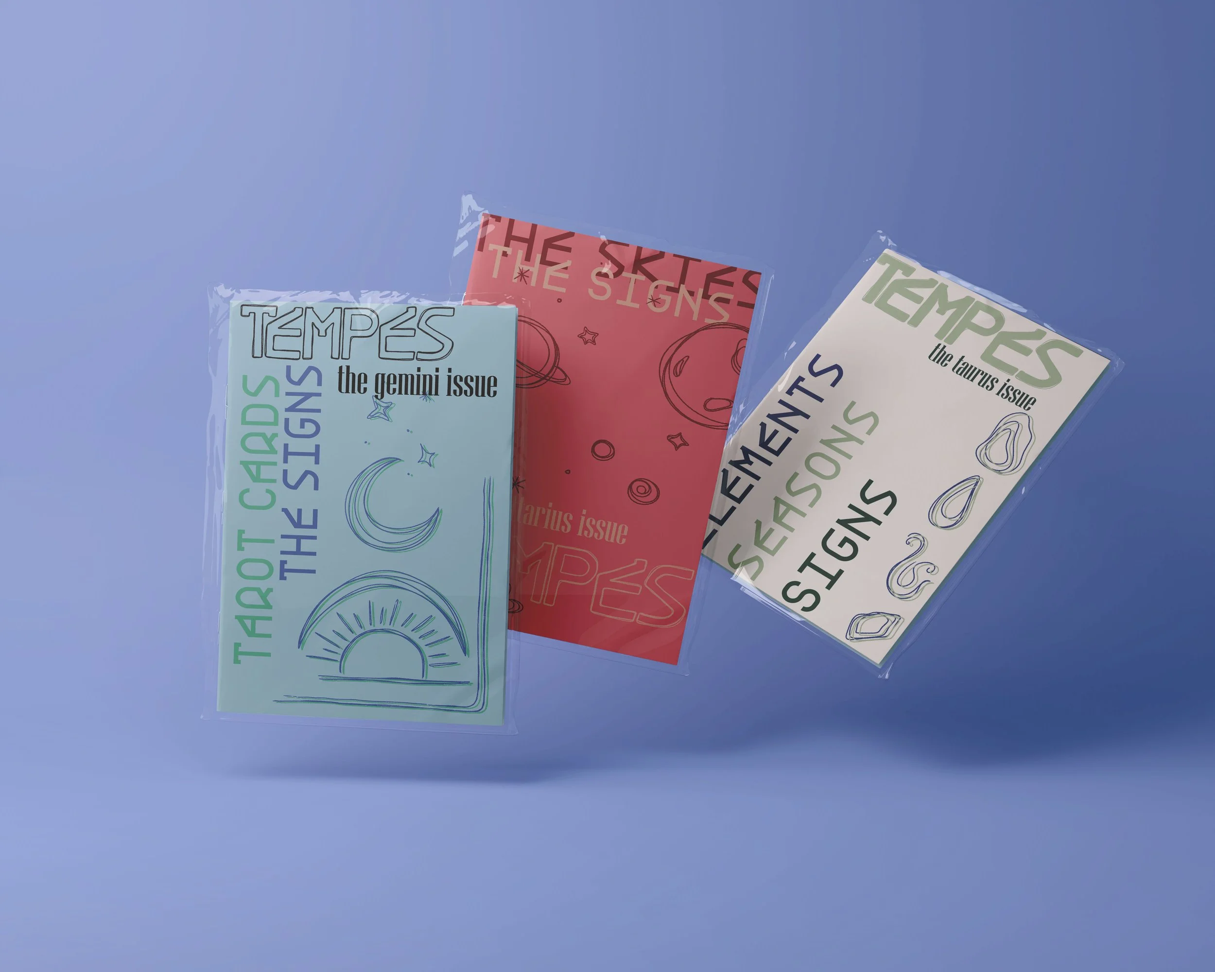
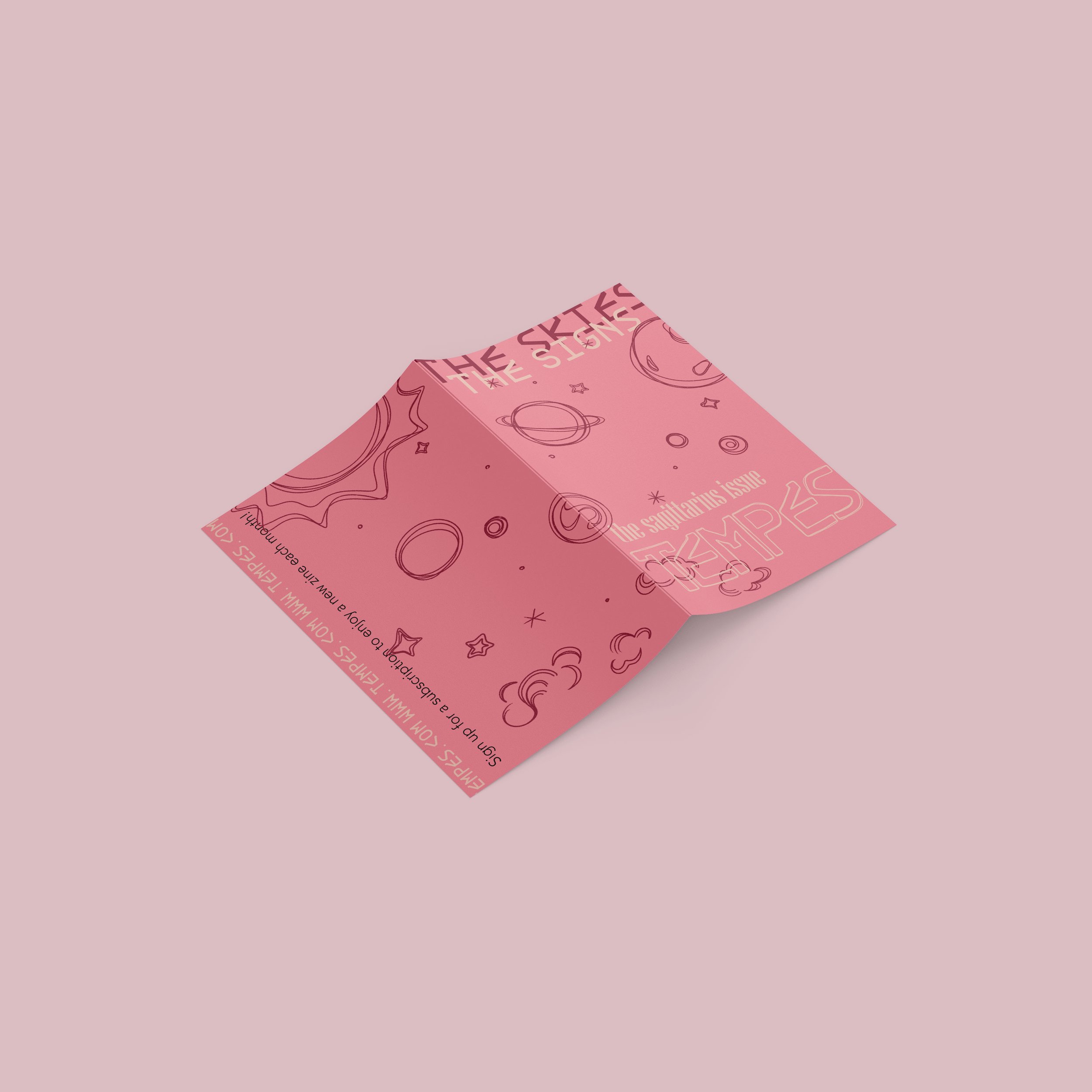
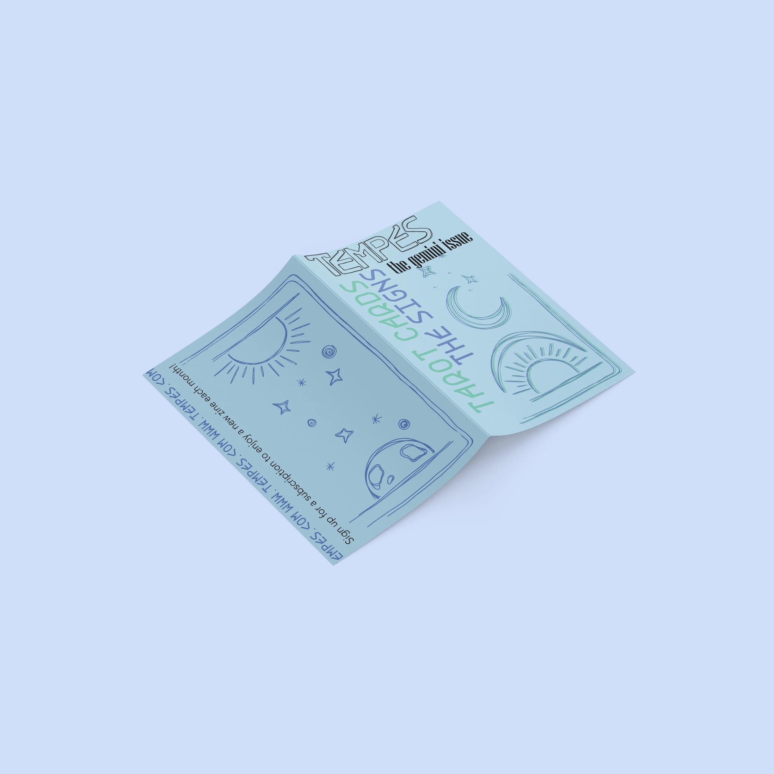
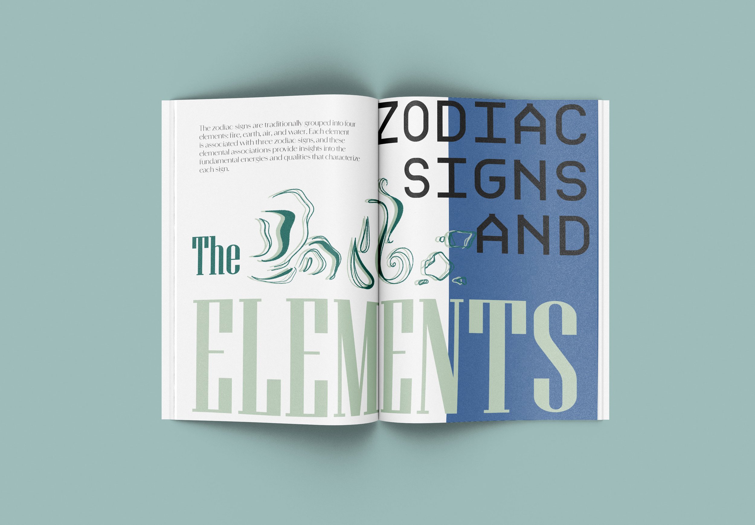
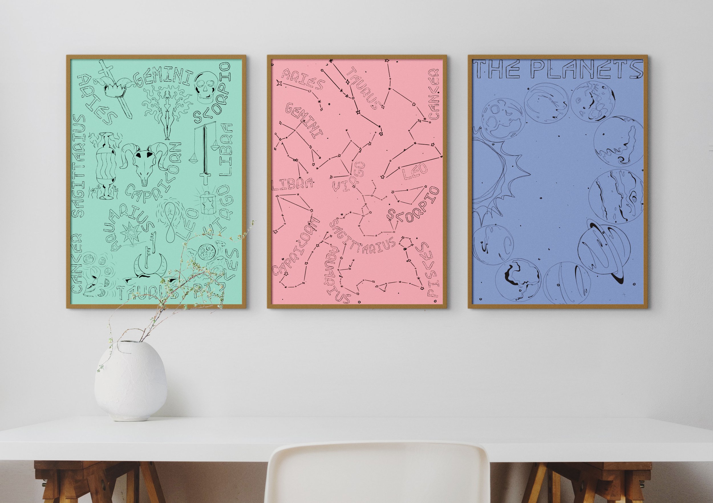
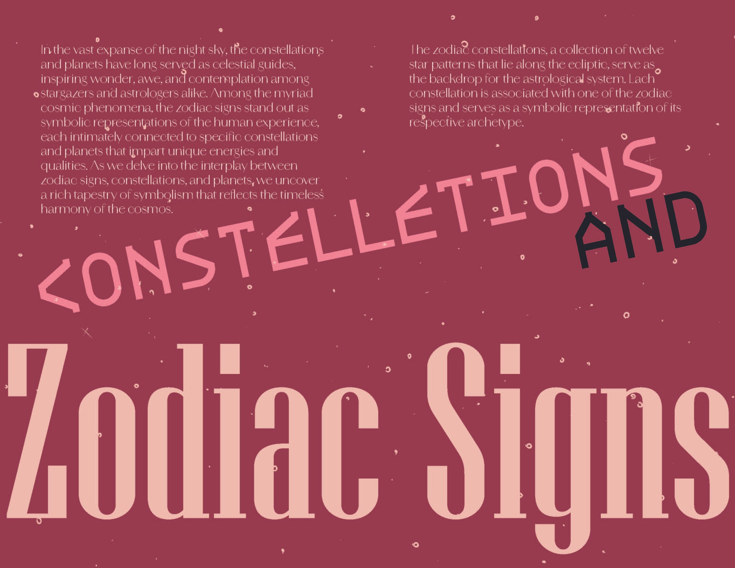
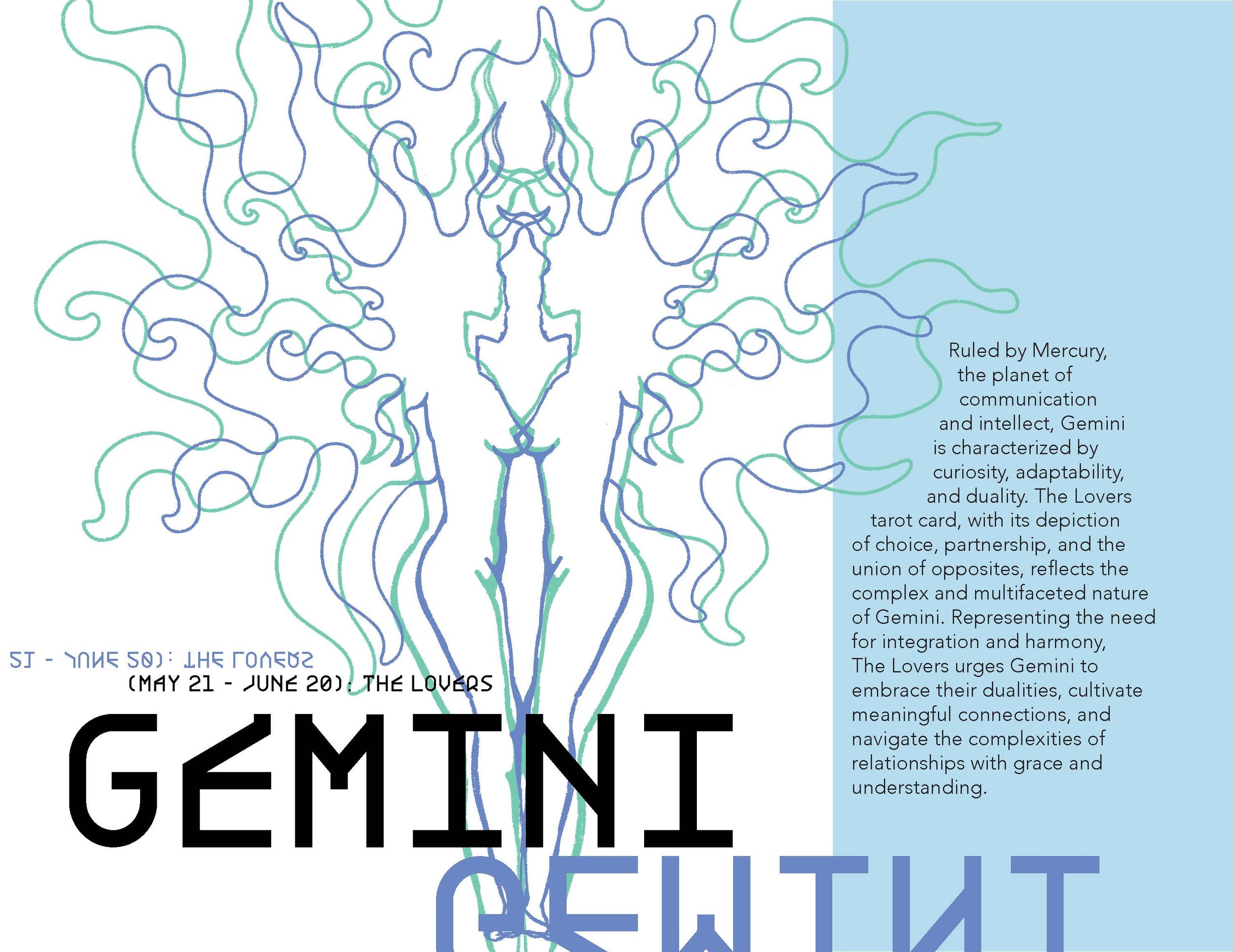
TEMPES is a fictional monthly zine subscription. Each month a new issue would be released and sent out to subscribers. These zines aim to be a source of not only information but entertainment for the people who already love or thrive to learn more about astrology and zodiac signs. Each zine has its own over arching theme having to do with zodiac signs, while also relating to and being inspired by that months specific sign, if the zine drops in May it would largely be inspired by what it means to be a Gemini sign.
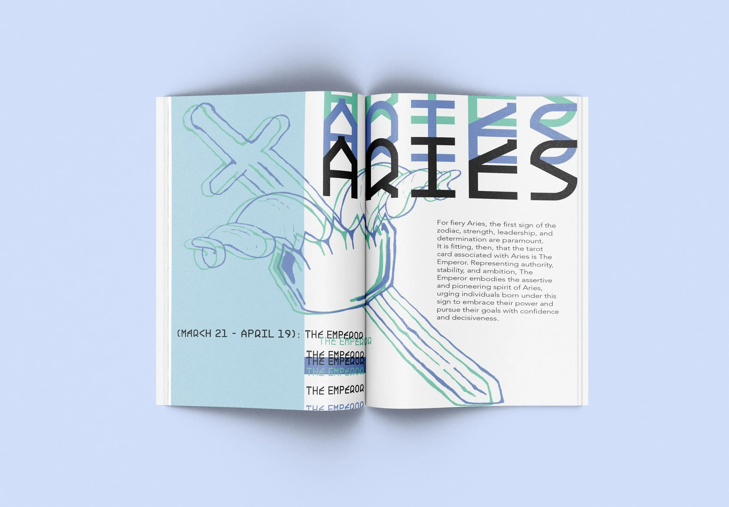
This project focuses on the use of illustration style and experimental type to tie layout together throughout three different issue of this zine subscription. While astrology is based in true science, it is then theorized and explain through more abstract interpretations. I wanted this reflected though the use of rough and loose almost more abstract illustration of well know symbols and imagery related to the topics. This illustration style interacting with bold and experimental type, allows for a more fluid and fun layout style.


ENJOY THE ZINES!


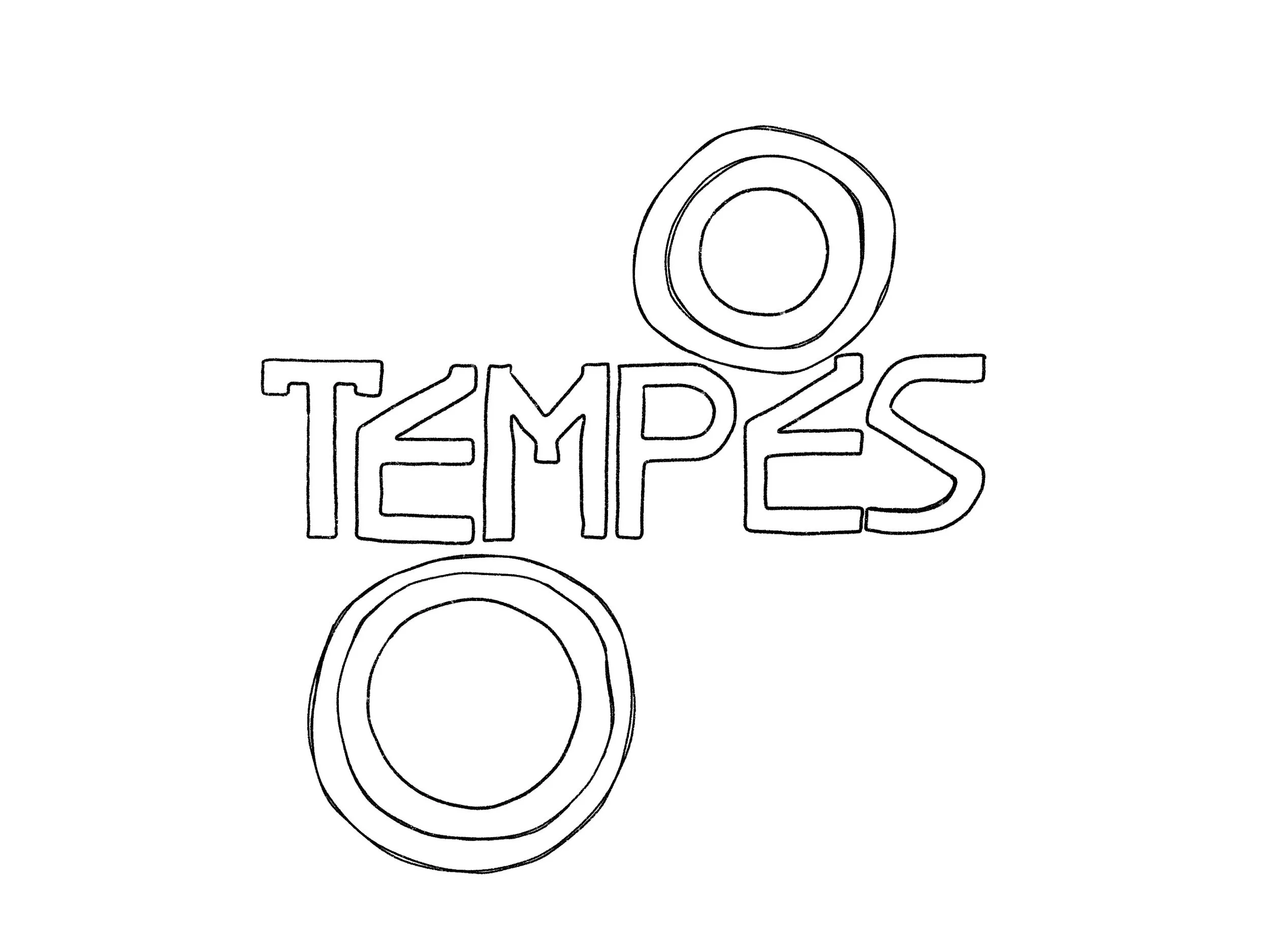
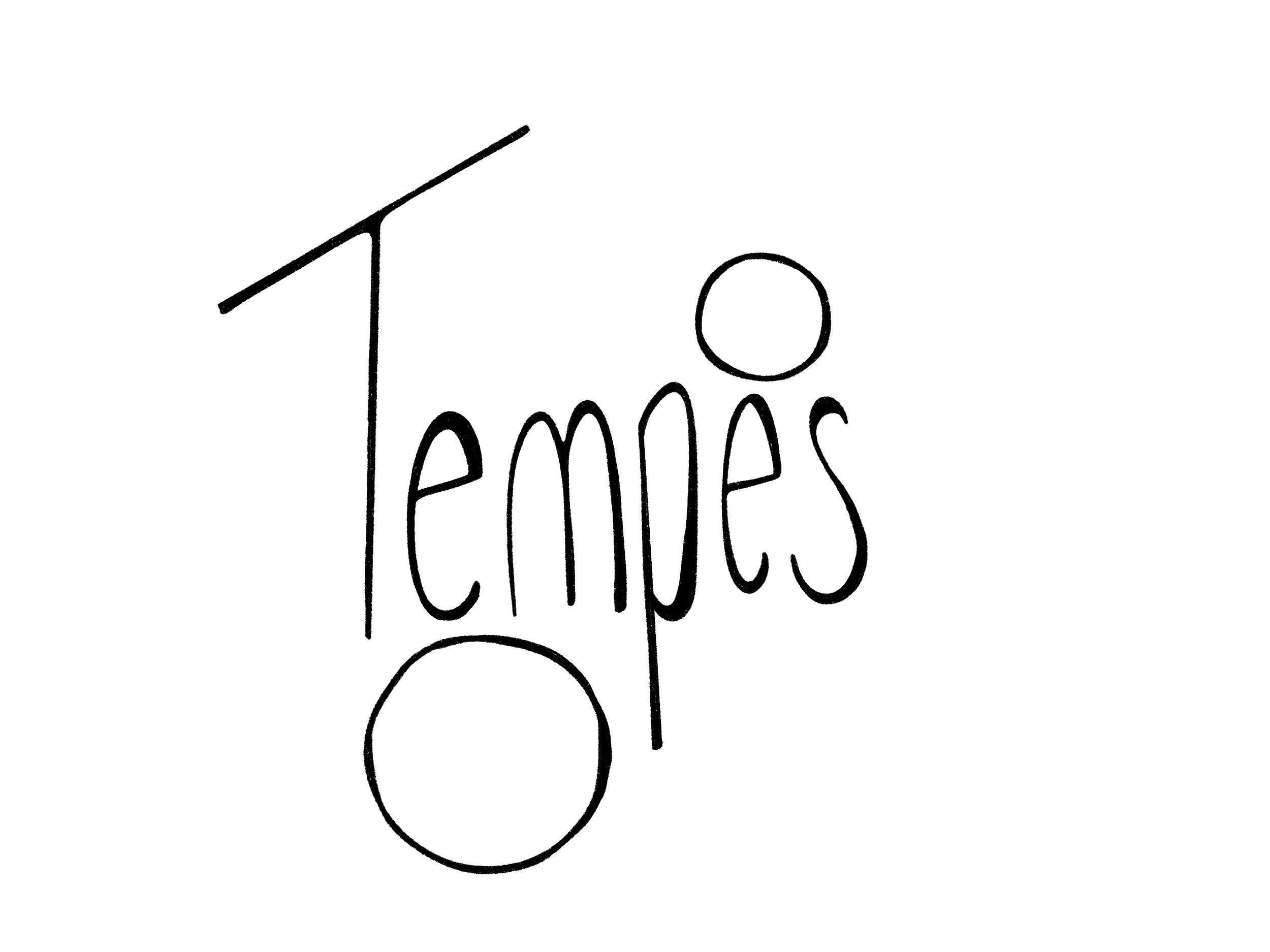
Logo Process
To create a unique style expressed through different issues of this publications I intended for the illustration style, typography choices and logo design to all be closely related.
The term “tempes” is loosely inspired for the latin words that refer to “time” and “changes.” I felt this was an appropriate name as it encompasses the over arching theme of astrology as interpreted by much of society as it is known as a way to explore peoples past, present and future life experiences and choices.
As I started to distinguish a loose almost rough feel while creating the abstract illustrations, I experimented with applying this style to different type choices. I ended up taking the font, BDRmono 2006, that is used consistently through out the layout design and applying this style to it.


Layout Design Process
As astrology is a more interpreted and abstract science or form of beliefs, I wanted the layout to emphasize this along with the more specific themes each spread was about. I had a lot of fun experimenting with type choices and playing with bold and interactive type. It was important for me to have not only the title type choices but also the body copy to interact with the illustrations, creating an overall interesting and active spread. The type is also used to emphasize the theme of each individual page and spread, for example if the spread is about space, the type might be seen floating on the page.


Conclusion
This zine subscription is mean to be a fun and informative way to bring together and allow new people to learn about the astrology community. The stylized illustrations, bold type and bright color choices are combined together to allow for an intriguing layout. My goal with this project was to create an aesthetically pleasing and successful stylized zine that would stay exciting yet consistent through the design of multiple issues.